前面的話
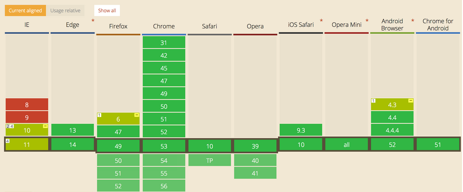
前面已經(jīng)詳細(xì)介紹過flex彈性盒模型的基本語(yǔ)法和兼容寫法,本文將介紹flex在布局中的應(yīng)用
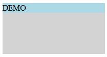
元素居中【1】伸縮容器上使用主軸對(duì)齊justify-content和側(cè)軸對(duì)齊align-items
JavaScript Code復(fù)制內(nèi)容到剪貼板
<style>
.parent{
display: flex;
justify-content: center;
align-items: center;
}
</style>
XML/HTML Code復(fù)制內(nèi)容到剪貼板
<div class="parent" style="background-color: lightgrey; height: 100px; width: 200px;">
<div class="in" style="background-color: lightblue;">DEMO</div>
</div>
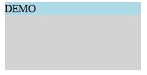
【2】在伸縮項(xiàng)目上使用margin:auto
CSS Code復(fù)制內(nèi)容到剪貼板
<style>
.parent{
display: flex;
}
.in{
margin: auto;
}
</style>
XML/HTML Code復(fù)制內(nèi)容到剪貼板
<div class="parent" style="background-color: lightgrey;height: 100px;width: 200px;">
<div class="in" style="background-color: lightblue;">DEMO</div>
</div>
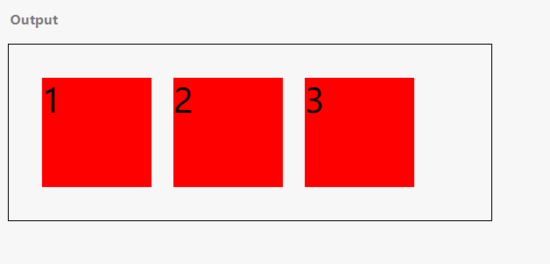
兩端對(duì)齊
CSS Code復(fù)制內(nèi)容到剪貼板
<style>
.parent{
display: flex;
justify-content:space-between
}
</style>
XML/HTML Code復(fù)制內(nèi)容到剪貼板
<div class="parent" style="background-color: lightgrey;height: 100px;width: 200px;">
<div class="in" style="background-color: lightblue;">DEMO</div>
<div class="in" style="background-color: lightgreen;">DEMO</div>
<div class="in" style="background-color: lightcyan;">DEMO</div>
<div class="in" style="background-color: lightseagreen;">DEMO</div>
新聞熱點(diǎn)


疑難解答