強化下perspective和transform:translateZ的用法。傳統(tǒng)的商品展示或許并不能很好的吸引用戶的注意力,但是如果在展示中添加適當?shù)?D元素,~說不定效果不錯哈~
效果圖:

說明一下:這個創(chuàng)意不是我想的,哈~模仿別人的,創(chuàng)意應該是w3cplus上的。當然了,重點是教大家如何做,就當高仿了~
首先,先教大家利用CSS3制作一個正方體:
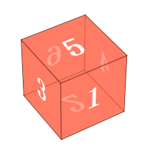
在木有CSS前,這樣的立方體,應該很難制作吧~嗯,我覺得很難~
html:
<body> <div class="wapper"> <div class="cube"> <div class="side front">1</div> <div class="side back">6</div> <div class="side right">4</div> <div class="side left">3</div> <div class="side top">5</div> <div class="side bottom">2</div> </div> </div> </body>
wapper為此效果的舞臺,即設(shè)置perspective的元素,如果多個元素共享一個舞臺,那么從一個視線觀察所以的元素的效果是不一樣的,就相當我們正常情況下,站在一排傾斜成45度的門前面,每個門對于我們視線來說,角度是不同的;div#cube代表一個立方體,然后6個DIV分別代表每個面。
div#cube設(shè)置transform-style:preserve-3d,然后每個元素設(shè)置rotate和translateZ
現(xiàn)在所有的面重疊在同一個平面上,我們分別讓:
font往前即Z軸方向移動半個邊長(translateZ(50px))的距離即50px;
back先繞Y軸旋轉(zhuǎn)180度,這樣讓字體是對外的,然后translateZ(50px),因為此時已經(jīng)旋轉(zhuǎn)了180度,所以tanslateZ是向下的,
同理,其他面分別繞X軸或者Y軸旋轉(zhuǎn)90度,然后translateZ(50px)
CSS:
.wapper { margin: 100px auto 0; width: 100px; height: 100px; -webkit-perspective: 1200px; font-size: 50px; font-weight: bold; color: #fff; } .cube { position: relative; width: 100px; -webkit-transform: rotateX(-40deg) rotateY(32deg); -webkit-transform-style: preserve-3d; } .side { text-align: center; line-height: 100px; width: 100px; height: 100px; background: rgba(255, 99, 71, 0.6); border: 1px solid rgba(0, 0, 0, 0.5); position: absolute; } .front { -webkit-transform: translateZ(50px); } .top { -webkit-transform: rotateX(90deg) translateZ(50px); } .right { -webkit-transform: rotateY(90deg) translateZ(50px); } .left { -webkit-transform: rotateY(-90deg) translateZ(50px); } .bottom { -webkit-transform: rotateX(-90deg) translateZ(50px); } .back { -webkit-transform: rotateY(-180deg) translateZ(50px); } 對于顯示效果,可以調(diào)節(jié)perspective的距離~
好了,立方體理解了,那么這個商品展示就沒什么難度了;兩個DIV分別代表兩個面,一個是圖片,一個是介紹,初始時,介紹繞X軸先旋轉(zhuǎn)90deg,然后當鼠標移動時,將整個盒子繞x軸旋轉(zhuǎn)90deg即可。
HTML:
<!DOCTYPE html> <html> <head> <title></title> <meta charset="utf-8"> <link href="css/reset.css" rel="stylesheet" type="text/css"> </head> <body> <ul id="content"> <li> <div class="wrapper"> <img src="images/a.png"> <span class="information"> <strong>Contact Form</strong> The easiest way to add a contact form to your shop. </span> </div> </li> <li> <div class="wrapper"> <img src="images/b.jpeg"> <span class="information"> <strong>Contact Form</strong> The easiest way to add a contact form to your shop. </span> </div> </li> <li> <div class="wrapper"> <img src="images/c.png"> <span class="information"> <strong>Contact Form</strong> The easiest way to add a contact form to your shop. </span> </div> </li> </ul> </body> </html>
CSS:
<style type="text/css"> body { font-family: Tahoma, Arial; } #content { margin: 100px auto 0; } #content li, #content .wrapper, #content li img, #content li span { width: 310px; height: 100px; } #content li { cursor: pointer; -webkit-perspective: 4000px; width: 310px; height: 100px; float: left; margin-left: 60px; /*box-shadow: 2px 2px 5px #888888;*/ } #content .wrapper { position: relative; -webkit-transform-style: preserve-3d; -webkit-transition: -webkit-transform .6s; } #content li img { top: 0; border-radius: 3px; box-shadow: 0px 3px 8px rgba(0, 0, 0, 0.3); position: absolute; -webkit-transform: translateZ(50px); -webkit-transition: all .6s; } #content li span { background: -webkit-gradient(linear, left top, left bottom, color-stop(0%, rgba(236, 241, 244, 1)), color-stop(100%, rgba(190, 202, 217, 1))); text-shadow: 1px 1px 1px rgba(255, 255, 255, 0.5); position: absolute; -webkit-transform: rotateX(-90deg) translateZ(50px); -webkit-transition: all .6s; display: block; top: 0; text-align: left; border-radius: 15px; font-size: 12px; padding: 10px; width: 290px; height: 80px; text-shadow: 1px 1px 1px rgba(255, 255, 255, 0.5); box-shadow: none; } #content li span strong { display: block; margin: .2em 0 .5em 0; font-size: 20px; font-family: "Oleo Script"; } #content li:hover .wrapper { -webkit-transform: rotateX(95deg); } #content li:hover img { box-shadow: none; border-radius: 15px; } #content li:hover span { box-shadow: 0px 3px 8px rgba(0, 0, 0, 0.3); border-radius: 3px; } </style> CSS基本在上面已經(jīng)分析過了,這里說明一點,我們給沒件商品弄了一個div.wapper看似是多余,其實不是,因為我們希望每個商品都是正常的90deg翻轉(zhuǎn),所以我們不能讓所有的商品共享一個舞臺,于是我們添加了一個div.wapper讓他設(shè)置transform-style:preverse-3d,然后每個li分別設(shè)置舞臺效果perspective。最終翻轉(zhuǎn)效果實在div.wapper上。
源碼點擊下載
以上就是本文的全部內(nèi)容,希望對大家的學習有所幫助,也希望大家多多支持武林網(wǎng)。
新聞熱點


疑難解答