最近在寫移動端 H5 應用,遇到一個值得記錄下來的點。現在從它的由來到實現,我們來聊一下移動端 1px,說 1px 不夠準確,應該說成 1 物理像素 。
通過閱讀下面文章,你將會理解以下問題:
問題
由來
基本概念
首先,我們要了解兩個概念,一個是 像素(pixel) 可以簡寫為 px ,另外一個是 設備像素比(DPR)
像素 :指在由一個數字序列表示的圖像中的一個最小單元,單位是 px,不可再次分割了。
設備像素比(DPR): 設備像素比 = 設備像素 / 設備獨立像素。復制代碼
下面我來簡單解釋下幾個概念
參考數據
各種類型的 iphone 手機屏幕設備的參數
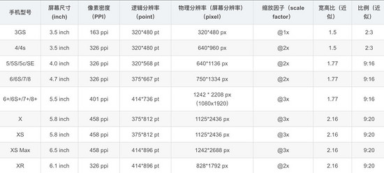
注:這里的縮放因子呢,就是 DRP 的值
設計稿對比數據

會有人好奇,為什么設計稿上顯示是 750x1334 呢,這是因為設計稿是顯示的 物理像素
而我們 css 中的像素是 邏輯像素 應該為 375x 667,在編寫代碼時要將自定義寬度設置成 375px
那么此時設計稿上的 1px 寬度實際代表的 css 參數應該是 0.5px 對應物理像素 1px,那么怎么實現這個物理像素為 1px 呢
實踐
歸根結底有兩種方案,一種是利用 css 中的 transfrom:scaleY(0.5) ,另一種是設置 媒體查詢根據不同 DPR 縮放
解決方案一
原理
利用 css 的 偽元素 ::after + transfrom 進行縮放
為什么用偽元素?因為偽元素 ::after 或 ::before 是獨立于當前元素,可以單獨對其縮放而不影響元素本身的縮放
偽元素大多數瀏覽器默認單引號也可以使用,和偽類一樣形式,而且單引號兼容性(ie)更好些
實現
<div class="cell border-1px"> cell <div><style>.cell { width: 100px; height: 100px;}<!--全部邊框-->.border-1px:after { content: ''; position: absolute; box-sizing: border-box; top: 0; left: 0; width: 200%; height: 200%; border: 1px solid #000; border-radius: 4px; -webkit-transform: scale(0.5); transform: scale(0.5); -webkit-transform-origin: top left;}<!--單邊框,以上邊框為例-->.border-1px-top:before { content: ""; position: absolute; top: 0; left: 0; right: 0; border-top: 1px solid red; transform: scaleY(.5); transform-origin: left top;}</style>解決方案二(升級方案一)
原理
使用 less 對公共代碼(方案一)封裝,同時增加媒體查詢分別對不同 DPR 的設備,進行不同的縮放
.border( @borderWidth: 1px; @borderStyle: solid; @borderColor: @lignt-gray-color; @borderRadius: 0) { position: relative; &:before { content: ''; position: absolute; width: 98%; height: 98%; top: 0; left: 0; transform-origin: left top; -webkit-transform-origin: left top; box-sizing: border-box; pointer-events: none; } @media (-webkit-min-device-pixel-ratio: 2) { &:before { width: 200%; height: 200%; -webkit-transform: scale(.5); } } @media (-webkit-min-device-pixel-ratio: 2.5) { &:before { width: 250%; height: 250%; -webkit-transform: scale(.4); } } @media (-webkit-min-device-pixel-ratio: 2.75) { &:before { width: 275%; height: 275%; -webkit-transform: scale(1 / 2.75); } } @media (-webkit-min-device-pixel-ratio: 3) { &:before { width: 300%; height: 300%; transform: scale(1 / 3); -webkit-transform: scale(1 / 3); } } .border-radius(@borderRadius); &:before { border-width: @borderWidth; border-style: @borderStyle; border-color: @borderColor; }}.border-all( @borderWidth: 1px; @borderStyle: solid; @borderColor: @lignt-gray-color; @borderRadius: 0) { .border(@borderWidth; @borderStyle; @borderColor; @borderRadius);}其他方案:
使用圖片:兼容性最好,靈活行最差,不能改變顏色、長度
使用 viewport 和 rem , js 動態改變 viewport 中 scale 縮放,缺點在于不適用于已有的項目,例如:使用 vh 和 vw 布局的
<meta name="viewport" id="WebViewport" content="initial-scale=1, maximum-scale=1, minimum-scale=1, user-scalable=no">
使用 css 漸變 linear-gradient 或者 box-shadow
上述 3 種方案均有致命缺陷暫不推薦使用
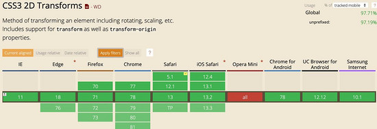
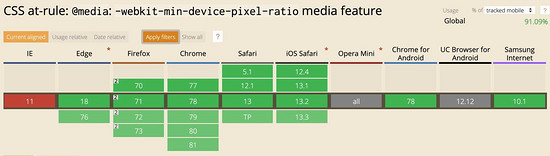
兼容性
最后看一下兼容性如何,主要是偽元素、 transform:scale 和 min-device-pixel-ratio 這幾個關鍵詞的兼容性

開源庫的解決方案
vant 組件庫
跳去 github 查看相關代碼
使用 less 寫的
.hairline-common() { position: absolute; box-sizing: border-box; content: ' '; pointer-events: none;}.hairline(@color: @border-color) { .hairline-common(); top: -50%; right: -50%; bottom: -50%; left: -50%; border: 0 solid @color; transform: scale(0.5);}也是采用第一種解決方案
ant-design-mobile 組件庫
跳去 github 查看相關代碼
.scale-hairline-common(@color, @top, @right, @bottom, @left) { content: ''; position: absolute; background-color: @color; display: block; z-index: 1; top: @top; right: @right; bottom: @bottom; left: @left;}.hairline(@direction, @color: @border-color-base) when (@direction = 'top') { border-top: 1PX solid @color; html:not([data-scale]) & { @media (min-resolution: 2dppx) { border-top: none; &::before { .scale-hairline-common(@color, 0, auto, auto, 0); width: 100%; height: 1PX; transform-origin: 50% 50%; transform: scaleY(0.5); @media (min-resolution: 3dppx) { transform: scaleY(0.33); } } } }}.hairline(@direction, @color: @border-color-base) when (@direction = 'right') { border-right: 1PX solid @color; html:not([data-scale]) & { @media (min-resolution: 2dppx) { border-right: none; &::after { .scale-hairline-common(@color, 0, 0, auto, auto); width: 1PX; height: 100%; background: @color; transform-origin: 100% 50%; transform: scaleX(0.5); @media (min-resolution: 3dppx) { transform: scaleX(0.33); } } } }}.hairline(@direction, @color: @border-color-base) when (@direction = 'bottom') { border-bottom: 1PX solid @color; html:not([data-scale]) & { @media (min-resolution: 2dppx) { border-bottom: none; &::after { .scale-hairline-common(@color, auto, auto, 0, 0); width: 100%; height: 1PX; transform-origin: 50% 100%; transform: scaleY(0.5); @media (min-resolution: 3dppx) { transform: scaleY(0.33); } } } }}.hairline(@direction, @color: @border-color-base) when (@direction = 'left') { border-left: 1PX solid @color; html:not([data-scale]) & { @media (min-resolution: 2dppx) { border-left: none; &::before { .scale-hairline-common(@color, 0, auto, auto, 0); width: 1PX; height: 100%; transform-origin: 100% 50%; transform: scaleX(0.5); @media (min-resolution: 3dppx) { transform: scaleX(0.33); } } } }}.hairline(@direction, @color: @border-color-base, @radius: 0) when (@direction = 'all') { border: 1PX solid @color; border-radius: @radius; html:not([data-scale]) & { @media (min-resolution: 2dppx) { position: relative; border: none; &::before { content: ''; position: absolute; left: 0; top: 0; width: 200%; height: 200%; border: 1PX solid @color; border-radius: @radius * 2; transform-origin: 0 0; transform: scale(0.5); box-sizing: border-box; pointer-events: none; // @media (min-resolution: 3dppx) { // width: 300%; // height: 300%; // border-radius: @radius * 3; // transform: scale(0.33); // } } } }}這個值得研究下,比 vant 和 第一種解決方案有點不同,主要在于處理了 DPR 為 2 和為 3 的兩種情況,相比來說更加完善。
這里 PX 大寫,為了防止插件將 px 轉成 rem 等單位
總結
通過該文,你大概了解 1px 問題的來龍去脈了吧,也明白了如何解決相關問題,如果這票文章能解決你的疑問或者工作中問題,不妨點個贊收藏下。
由于技術水平有限,文章中如有錯誤地方,請在評論區指出,感謝!
以上就是本文的全部內容,希望對大家的學習有所幫助,也希望大家多多支持武林網。
新聞熱點


疑難解答