svg讓動畫沿著不規則路徑運動
查閱svg文檔后發現,svg動畫運動有兩種實現方式,且都非常簡單,但對于100%實現設計師給出的效果有很大的距離
使用offset-path偏移路徑和offset-roate偏移角度讓元素沿著不規則路徑走
<!DOCTYPE html> <html> <head> <title>offset-path/offset-roate</title> </head> <style type="text/css"> * { padding: 0; margin: 0; box-sizing: border-box; } body { background: #000; } .line { width: 80px; height: 3px; position: absolute; background: red; offset-path: path("M10 80 L 77.5 60 L 145 80 L 280 100 L 500 80 L 600 120 L 800 80 L 950 120 L 950 200 L 930 250 L 950 300 L 950 500"); animation: move 10s linear infinite; } @keyframes move { 100% { offset-distance: 2000px; } } .line1 { position: absolute; left: 100px; width: 20px; height: 20px; border-radius: 50%; background: red; offset-path: path("M0,0a72.5,72.5 0 1,0 145,0a72.5,72.5 0 1,0 -145,0"); offset-rotate: 0deg; animation: load 1.8s cubic-bezier(0.86, 0, 0.07, 1) infinite; animation-delay: 0.147s; animation-fill-mode: forwards; } @keyframes load { from { offset-distance: 0; } to { offset-distance: 100%; } } </style> <body> <h2>路徑偏移</h2> <div class="line"></div> <svg width="100%" height="600px" version="1.0" id="svg1"> <path d="M10 80 L 77.5 60 L 145 80 L 280 100 L 500 80 L 600 120 L 800 80 L 950 120 L 950 200 L 930 250 L 950 300 L 950 500" fill="#tranparent" stroke="#FFF"></path> </svg> <h2>角度偏移</h2> <div class="line1"> </div> </body> </html>此種方式的限制是滾動元素無法隨路徑進行沒有規律的變化
使用stroke-dasharray和stroke-dashoffset讓路徑邊線動起來
stroke-dasharray:設置shap和text 邊框虛線的實線長度與實線之間的間隔(虛線長度)
stroke-dashoffser:設置邊框線條相對于默認位置的偏移(正值:向左,負值:向右)
<!DOCTYPE html> <html> <head> <title>stroke-dasharray/stroke-dashoffser</title> </head> <style type="text/css"> * { padding: 0; margin: 0; box-sizing: border-box; } body { background: #000; color: #fff; } .move { animation: moving 5s infinite; } @keyframes moving { 0% { stroke-dashoffset: 80px; } 100% { stroke-dashoffset: -1600px; } } </style> <body> <h2>設置stroke-dasharray</h2> <b>storke-dasharray設置為80 ,此時實線和實線間隔一樣</b> <svg width="100%" height="600px" version="1.0" id="svg1"> <path d="M10 80 L 77.5 60 L 145 80 L 280 100 L 500 80 L 600 120 L 800 80 L 950 120 L 950 200 L 930 250 L 950 300 L 950 500" fill="#tranparent" stroke="#FFF" stroke-dasharray="80"></path> </svg> <b>storke-dasharray設置為80 320,此時實線和是實線間隔的1/4</b> <svg width="100%" height="600px" version="1.0" id="svg1"> <path d="M10 80 L 77.5 60 L 145 80 L 280 100 L 500 80 L 600 120 L 800 80 L 950 120 L 950 200 L 930 250 L 950 300 L 950 500" fill="#tranparent" stroke="#FFF" stroke-dasharray="80 320"></path> </svg> <h2>設置stroke-dashoffset讓邊線相對于初始位置發生偏移</h2> <svg width="100%" height="600px" version="1.0" id="svg1"> <path d="M10 80 L 77.5 60 L 145 80 L 280 100 L 500 80 L 600 120 L 800 80 L 950 120 L 950 200 L 930 250 L 950 300 L 950 500" fill="#tranparent" stroke="#FFF" stroke-dasharray="80 320" stroke-dashoffset="40"></path> </svg> <h2>通過設置stroke-dasharray 和 stroke-dashoffset讓邊線動起來</h2> <svg width="100%" height="600px" version="1.0" id="svg1"> <path d="M10 80 L 77.5 60 L 145 80 L 280 100 L 500 80 L 600 120 L 800 80 L 950 120 L 950 200 L 930 250 L 950 300 L 950 500" fill="#tranparent" stroke="#FFF"></path> <path d="M10 80 L 77.5 60 L 145 80 L 280 100 L 500 80 L 600 120 L 800 80 L 950 120 L 950 200 L 930 250 L 950 300 L 950 500" fill="#tranparent" stroke="red" stroke-dasharray="80 1600" stroke-dashoffset="0" class="move"></path> </svg> </body> </html>此種方式通過邊框偏移的效果可以設置跟隨路徑的滾線條,但是無法設置線條的光線效果,即實線的陰影和實線的漸變效果(漸變區域需隨著偏移路徑的變化而變化)
canvas實現線條延不規則路徑運動
線條實現
對于不規則路徑,如果直接用畫線條的方式實現光線,需要計算每一個開始點和結束點的位置,中間還可能存在轉折點,計算起來非常麻煩,不可取
故這邊采取canvas組合圖形的模式,取線條和一個圖形重疊部分(類似于燈罩)來實現光線效果
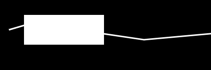
組合前
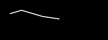
組合后
<!DOCTYPE html> <html> <head> <title>canvas實現不規則路徑光效</title> </head> <style type="text/css"> body { background: #000; } #wrap { position: absolute; width: 1200px; height: 600px } </style> <body> <div id="wrap"> <canvas id="canvas" width="1200" height="600"></canvas> </div> </body> <script type="text/javascript"> var path = 'M 10 80 L 77.5 60 L 145 80 L 280 100 L 500 80 L 600 120 L 800 80 L 950 120 L 950 200 L 930 250 L 950 300 L 950 500'; var list = path.match(/([A-Z]([^A-Z]){1,})/g).map(item => { return { x: item.split(' ')[1], y: item.split(' ')[2], action: item.split(' ')[0], } });//獲取每個點位置 var canvas = document.getElementById('canvas'); var ctx = canvas.getContext('2d'); ctx.strokeStyle = 'rgba(255,255,255,1)'; function drawPath() { ctx.lineWidth = 3; ctx.beginPath(); list.forEach(item => { if(item.action == 'M') ctx.moveTo(item.x, item.y); if(item.action == 'L') ctx.lineTo(item.x, item.y); }); ctx.stroke(); } drawPath(); function drawLine() { //設置圖形組合方式 默認source-over ctx.globalCompositeOperation = "destination-in"; ctx.lineWidth = 60; ctx.beginPath(); ctx.moveTo(40, 80); ctx.lineTo(200, 80); ctx.stroke(); } drawLine(); </script> </html>讓線條動起來
當我們實現好線條剩下就需要讓線條動起來,由于線條是通過燈罩的方式來實現的,讓線條運動只需要讓燈罩動起來就好
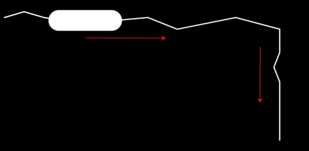
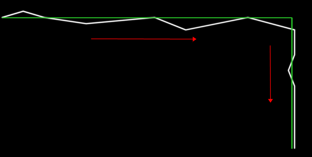
<!DOCTYPE html> <html> <head> <title>canvas實現不規則路徑光效</title> </head> <style type="text/css"> body { background: #000; } #wrap { position: absolute; width: 1200px; height: 600px } </style> <body> <div id="wrap"> <canvas id="canvas" width="1200" height="600"></canvas> </div> </body> <script type="text/javascript"> var path = 'M 10 80 L 77.5 60 L 145 80 L 280 100 L 500 80 L 600 120 L 800 80 L 950 120 L 950 200 L 930 250 L 950 300 L 950 500'; var list = path.match(/([A-Z]([^A-Z]){1,})/g).map(item => { return { x: item.split(' ')[1], y: item.split(' ')[2], action: item.split(' ')[0], } });//獲取每個點位置 var step = 3; var x1, x2, y1, y2;//確定路徑中最大最小點 var timer; var canvas = document.getElementById('canvas'); var ctx = canvas.getContext('2d'); ctx.strokeStyle = 'rgba(255,255,255,1)'; ctx.shadowColor = 'rgba(255,255,255,1)'; ctx.lineCap = 'round'; ctx.shadowBlur = 3; list.forEach(item => { x1 = !x1 || Number(item.x) < x1 ? Number(item.x) : x1; y1 = !y1 || Number(item.y) < y1 ? Number(item.y) : y1; x2 = !x2 || Number(item.x) > x2 ? Number(item.x) : x2; y2 = !y2 || Number(item.y) > y2 ? Number(item.y) : y2; }); function drawPath() { ctx.lineWidth = 3; ctx.beginPath(); list.forEach(item => { if(item.action == 'M') ctx.moveTo(item.x, item.y); if(item.action == 'L') ctx.lineTo(item.x, item.y); }); //添加光效漸變 var grd = ctx.createLinearGradient(arrLine[arrLine.length - 1].x, arrLine[arrLine.length - 1].y, arrLine[0].x, arrLine[0].y); grd.addColorStop(0, 'rgba(255, 255, 255, 0)'); //定義漸變線起點顏色 grd.addColorStop(1, 'rgba(255, 255, 255, 1)'); //定義漸變線結束點的顏色 ctx.strokeStyle = grd; ctx.stroke(); } //設計合適的初始線條狀態 var arrLine = Array(10).fill(0).map((item, inx) => { return { x: x1 - 20 * inx, y: y1 + 30, } }); //隨時間變化圖形路徑 function getArrLine() { var isEnd arrLine = arrLine.map(item => { var x = item.x; var y = item.y; if(x < x2 - 30) { x = x + step > x2 -30 ? x2 - 30 : x + step; } else if(x == x2 -30 && y < y2) { y = y + step > y2 ? y2 : y + step; } else { isEnd = true; } return { x, y } }); isEnd && timer && cancelAnimationFrame(timer); } //繪制圖形 function drawLine() { //設置圖形組合方式 默認source-over ctx.globalCompositeOperation = "destination-in"; ctx.lineWidth = 70; ctx.beginPath(); arrLine.forEach((item, inx) => { if(inx == 0) { ctx.moveTo(item.x, item.y); } else { ctx.lineTo(item.x, item.y); } }) ctx.stroke(); } function start() { ctx.clearRect(0, 0, 1200, 600); ctx.globalCompositeOperation = 'source-over'; drawPath(); drawLine(); getArrLine(); timer = requestAnimationFrame(start); } timer = requestAnimationFrame(start); </script> </html>這種實現方式也有一定的條件限制,那就是路徑可大體抽象成為一個有一定規律的圖型或者線條,比如上面demo中路徑可抽象成為一個矩形的兩邊,或者是2條連接的直線
我們必須從沒有具體規則的路徑中抽象出一個大體的規則,不同路徑規則不同
上面的例子就是將不規則路徑抽象成了一個直角的規則路徑
可優化點
這邊找到了2個可優化的點
1.時間方向上: 為了讓動畫消耗較小,代碼中的定時器已經用的是requestAnimationFrame, 但是由于光線的特殊性(自帶模糊效果),為了性能更加,嘗試了2次requestAnimationFrame調用一次繪圖的方式,效果較前者未有明顯區別
2.繪圖方向上: 從上圖可發現,燈罩每次只圈出路徑的一部分,故繪圖中不需要每次都繪制全部路徑,只需要找出燈罩前后的路徑點,將這一段路徑繪制出來就好
坑點
在完成這個動動畫效果之后遇到一個至今原因不明的bug,隨著屏幕放置時間的變長,動畫越來越慢,打開任務管理器,未見內存泄漏或者cpu使用率過高。打開performance,發現頁面調幀嚴重,屏幕幀數越來越低,單個Frame CPU time越來越長,范圍來看,script和render和paint耗時未發生線性變化,只有system時間越來越來長,越來越長,期望能被大佬告知原因
一開始
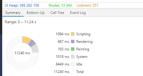
到后來

解決的辦法較為...,光線每循環一個周期,我銷毀了之前的canvas并新建了canvas,上層規避了system time不知道為什么越來越長的問題
chrome版本:80.0.3987.163(正式版本) (64 位)
到此這篇關于html5 canvas 實現光線沿不規則路徑運動的文章就介紹到這了,更多相關canvas 光線不規則運動內容請搜索武林網以前的文章或繼續瀏覽下面的相關文章,希望大家以后多多支持武林網!
新聞熱點


疑難解答