1. iPhoneX的介紹
屏幕尺寸
我們熟知的iPhone系列開發(fā)尺寸概要如下:
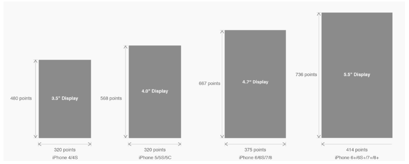
△ iPhone各機型的開發(fā)尺寸
轉(zhuǎn)化成我們熟知的像素尺寸:
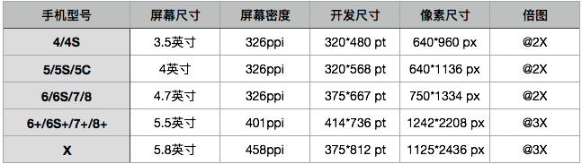
△ 每個機型的多維度尺寸
倍圖其實就是像素尺寸和開發(fā)尺寸的倍率關(guān)系,但這只是外在的表現(xiàn)。倍圖核心的影響因素在于PPI(DPI),了解屏幕密度與各尺寸的關(guān)系有助于我們深度理解倍率的概念:《基礎(chǔ)知識學(xué)起來!為設(shè)計師量身打造的DPI指南》
iPhone8在本次升級中,屏幕尺寸和分辨率都遺傳了iPhone6以后的優(yōu)良傳統(tǒng);
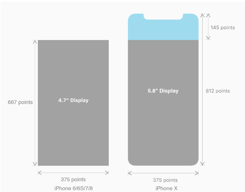
然而iPhone X 無論是在屏幕尺寸、分辨率、甚至是形狀上都發(fā)生了較大的改變,下面以iPhone 8作為參照物,看看到底iPhone X的適配我們要怎么考慮。
我們看看iPhone X尺寸上的變化:
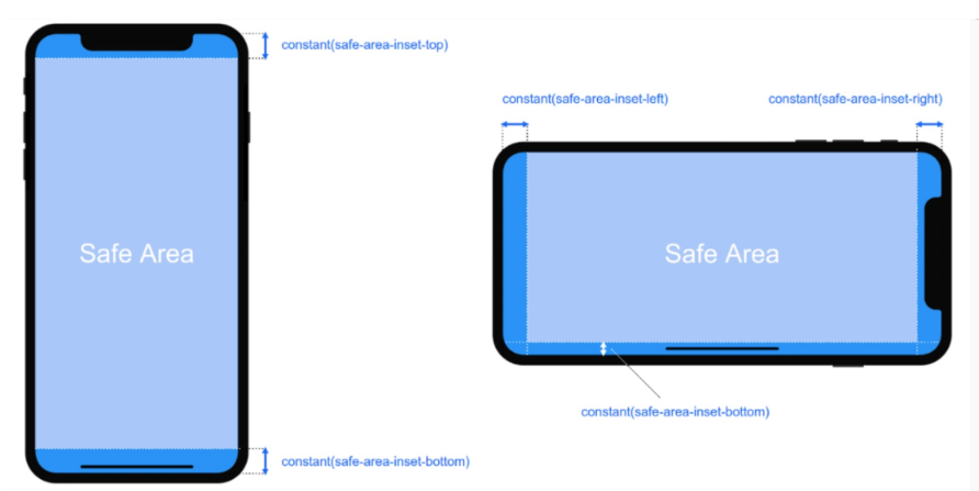
2. iPhoneX的適配---安全區(qū)域(safe area)
蘋果對于 iPhone X 的設(shè)計布局意見如下:
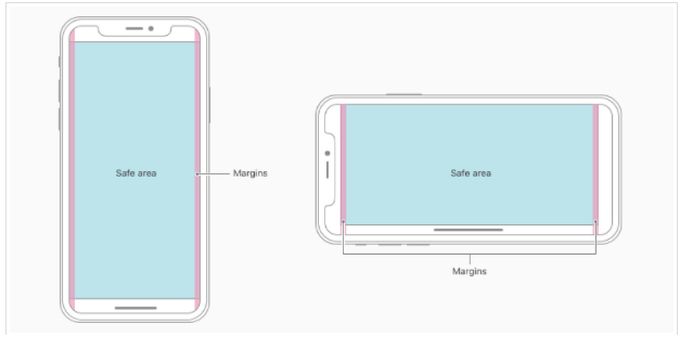
核心內(nèi)容應(yīng)該處于 Safe area 確保不會被設(shè)備圓角(corners),傳感器外殼(sensor housing,齊劉海) 以及底部的 Home Indicator 遮擋。也就是說 我們設(shè)計顯示的內(nèi)容應(yīng)該盡可能的在安全區(qū)域內(nèi);
3. iPhoneX的適配---適配方案viewport-fit 3.1 PhoneX的適配,在iOS 11中采用了viewport-fit的meta標(biāo)簽作為適配方案;viewport-fit的默認值是auto。
viewport-fit取值如下:
| auto | 默認:viewprot-fit:contain;頁面內(nèi)容顯示在safe area內(nèi) |
| cover | viewport-fit:cover,頁面內(nèi)容充滿屏幕 |
viewport-fit meta標(biāo)簽設(shè)置(cover時)
<meta name="viewport" content="width=device-width,initial-scale=1.0, minimum-scale=1.0, maximum-scale=1.0, user-scalable=no, viewport-fit=cover">
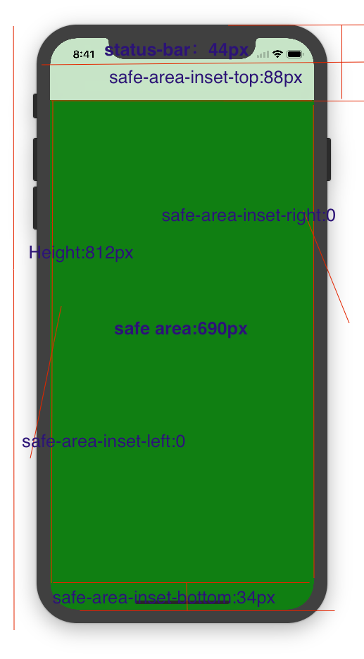
3.2 css constant()函數(shù) 與safe-area-inset-top &safe-area-inset-left &safe-area-inset-right &safe-area-inset-bottom的介紹
如上圖所示 在iOS 11中的WebKit包含了一個新的CSS函數(shù)constant(),以及一組四個預(yù)定義的常量:safe-area-inset-left,safe-area-inset-right,safe-area-inset-top和safe-area-inset-bottom。當(dāng)合并一起使用時,允許樣式引用每個方面的安全區(qū)域的大小。
3.1當(dāng)我們設(shè)置viewport-fit:contain,也就是默認的時候時;設(shè)置safe-area-inset-left,safe-area-inset-right,safe-area-inset-top和safe-area-inset-bottom等參數(shù)時不起作用的。
3.2當(dāng)我們設(shè)置viewport-fit:cover時:設(shè)置如下
body { padding-top: constant(safe-area-inset-top); //為導(dǎo)航欄+狀態(tài)欄的高度 88px padding-left: constant(safe-area-inset-left); //如果未豎屏?xí)r為0 padding-right: constant(safe-area-inset-right); //如果未豎屏?xí)r為0 padding-bottom: constant(safe-area-inset-bottom);//為底下圓弧的高度 34px }4. iPhoneX的適配---高度統(tǒng)計
viewport-fit:cover + 導(dǎo)航欄
5.iPhoneX的適配---媒體查詢
注意這里采用的是690px(safe area高度),不是812px;
@media only screen and (width: 375px) and (height: 690px){ body { background: blue; }}6.iphoneX viewport-fit
問題總結(jié)
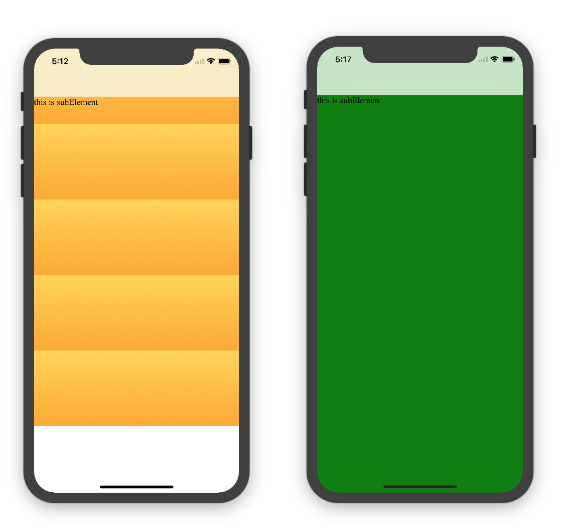
1.關(guān)于iphoneX 頁面使用了漸變色時;如果viewport-fit:cover;
1.1在設(shè)置了背景色單色和漸變色的區(qū)別,如果是單色時會填充整個屏幕,如果設(shè)置了漸變色 那么只會更加子元素的高度去渲染;而且頁面的高度只有690px高度,上面使用了padding-top:88px;
body固定為:
<body><div class="content">this is subElement</div></body>
1.單色時:
* { padding: 0; margin: 0; } body { background:green; padding-top: constant(safe-area-inset-top); //88px /*padding-left: constant(safe-area-inset-left);*/ /*padding-right: constant(safe-area-inset-right);*/ /*padding-bottom: constant(safe-area-inset-bottom);*/ }2.漸變色
* { padding: 0; margin: 0; } body { background:-webkit-gradient(linear, 0 0, 0 bottom, from(#ffd54f), to(#ffaa22)); padding-top: constant(safe-area-inset-top); //88px /*padding-left: constant(safe-area-inset-left);*/ /*padding-right: constant(safe-area-inset-right);*/ /*padding-bottom: constant(safe-area-inset-bottom);*/ }解決使用漸變色 仍舊填充整個屏幕的方法;CSS設(shè)置如下

<!DOCTYPE html><html><head> <meta name="viewport" content="initial-scale=1, viewport-fit=cover"> <title>Designing Websites for iPhone X: Respecting the safe areas</title> <style> * { padding: 0; margin: 0; } html, body { height: 100%; } body { padding-top: constant(safe-area-inset-top); padding-left: constant(safe-area-inset-left); padding-right: constant(safe-area-inset-right); padding-bottom: constant(safe-area-inset-bottom); } .content { background: -webkit-gradient(linear, 0 0, 0 bottom, from(#ffd54f), to(#ffaa22)); width: 100%; height: 724px; } </style></head><body><div class="content">this is subElement</div></body></html>2.頁面元素使用了固定定位的適配即:{position:fixed;}
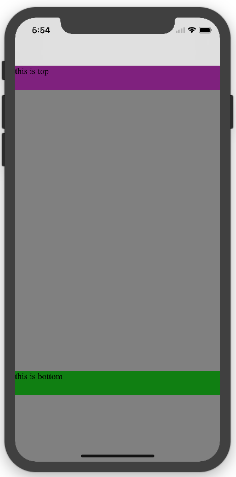
2.1 子元素頁面固定在底部時;使用viewport-fit:contain時;可以看到bottom:0時只會顯示在安全區(qū)域內(nèi);
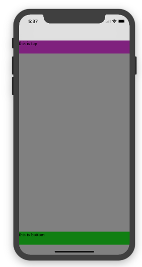
<!DOCTYPE html><html><head> <meta name="viewport" content="initial-scale=1"> <!--<meta name="viewport" content="initial-scale=1, viewport-fit=cover">--> <title>Designing Websites for iPhone X: Respecting the safe areas</title> <style> * { padding: 0; margin: 0; } /*html,body {*/ /*height: 100%;*/ /*}*/ body { background: grey; /*padding-top: constant(safe-area-inset-top);*/ /*padding-left: constant(safe-area-inset-left);*/ /*padding-right: constant(safe-area-inset-right);*/ /*padding-bottom: constant(safe-area-inset-bottom);*/ } .top { width: 100%; height: 44px; background: purple; } .bottom { position: fixed; bottom: 0; left: 0; right: 0; height: 44px; color: black; background: green; } </style></head><body> <div class="top">this is top</div> <div class="bottom">this is bottom</div></body></html>2.1 子元素頁面固定在底部時;使用viewport-fit:cover時;可以看到bottom:0時只會顯示在安全區(qū)域內(nèi);
添加html,body {width:100%;heigth:100%}
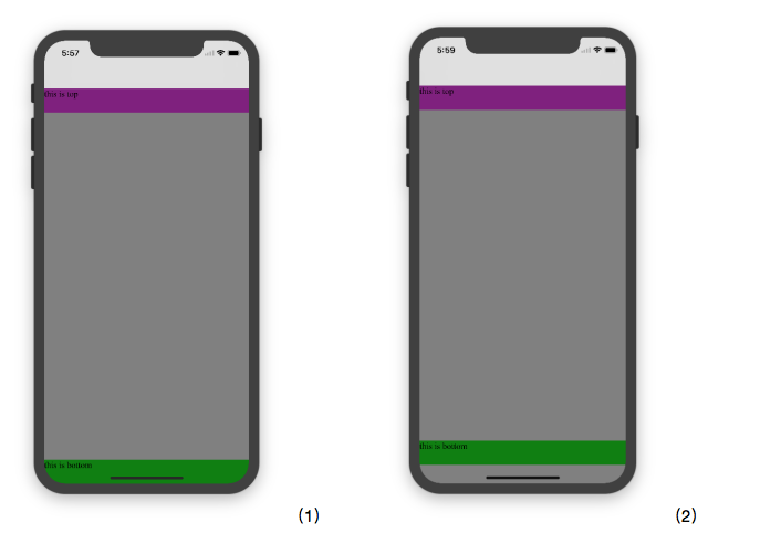
圖1:
* { padding: 0; margin: 0; } html,body { height: 100%; } body { background: grey; padding-top: constant(safe-area-inset-top); padding-left: constant(safe-area-inset-left); padding-right: constant(safe-area-inset-right); padding-bottom: constant(safe-area-inset-bottom); } .top { width: 100%; height: 44px; background: purple; } .bottom { position: fixed; bottom: 0; left: 0; right: 0; height: 44px; color: black; background: green; }圖2:
* { padding: 0; margin: 0; } html,body { height: 100%; } body { background: grey; padding-top: constant(safe-area-inset-top); padding-left: constant(safe-area-inset-left); padding-right: constant(safe-area-inset-right); /*padding-bottom: constant(safe-area-inset-bottom);*/ } .top { width: 100%; height: 44px; background: purple; } .bottom { position: fixed; bottom: 0; left: 0; right: 0; height: 44px; color: black; background: green; }2.3 關(guān)于alertView彈框 遮罩層的解決方案

<!DOCTYPE html><html lang="en"><head> <meta charset="UTF-8"> <!--<meta name="viewport" content="width=device-width, initial-scale=1.0, minimum-scale=1.0, maximum-scale=1.0, user-scalable=no">--> <meta name="viewport" content="width=device-width,initial-scale=1.0, minimum-scale=1.0, maximum-scale=1.0, user-scalable=no, viewport-fit=cover"> <meta http-equiv="pragma" content="no-cache"> <meta http-equiv="cache-control" content="no-cache"> <meta http-equiv="expires" content="0"> <title>alertView</title> <script data-res="eebbk"> document.documentElement.style.fontSize = window.screen.width / 7.5 + 'px'; </script> <style> * { margin: 0; padding: 0; } html,body { width: 100%; height: 100%; } body { font-size: 0.32rem; padding-top: constant(safe-area-inset-top); padding-left: constant(safe-area-inset-left); padding-right: constant(safe-area-inset-right); padding-bottom: constant(safe-area-inset-bottom); } .content { text-align: center; } .testBut { margin: 50px auto; width: 100px; height: 44px; border: 1px solid darkgray; outline:none; user-select: none; background-color: yellow; } </style> <link href="alertView.css" rel="stylesheet" type="text/css"></head><body> <section class="content"> <button class="testBut" onclick="showLoading()">彈框加載</button> </section> <script type="text/javascript" src="alertView.js"></script> <script> function showLoading() { UIAlertView.show({ type:"input", title:"溫馨提示", //標(biāo)題 content:"VIP會員即將到期", //獲取新的 isKnow:false }); var xx = new UIAlertView(); console.log(xx); } </script></body></html>總結(jié)
以上所述是小編給大家介紹的有關(guān)HTML5頁面在iPhoneX適配問題,希望對大家有所幫助,如果大家有任何疑問請給我留言,小編會及時回復(fù)大家的。在此也非常感謝大家對武林網(wǎng)網(wǎng)站的支持!
新聞熱點


疑難解答